May 05, 2005
corner image

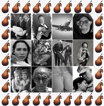
Here is the image the site designer will be using for the corner.
Jeremy sendzz...
Posted by Jess at May 5, 2005 04:46 PMNice... the pears are a great theme border!
expression on the older lady's face which is right next to the thong pic... hmmm, i say, hmmm.
Perhaps she needs a little whipped cream with that?
Relax JulieB, Your whipped cream comment is safely stowed away in under the rotating "ACCUSATIONS" header. You just have to keep refreshing to find it.
...and actually, that's an old GUY! (Yes, that placement was semi-intentional.)
Hey Jeremy,
I have IE at work, at it looks a bit funky. The pic pushes the left side-bar over the posts.
Looked fine in Firefox.
I'm just in a whipped cream mood.... life seems to be lacking that nice, smooth, creamy, . . . . um, substance lately.
OK, i'm going to go get a mocha with extra whipped cream and see if i can - - work thru the whipped cream fetish.
Posted by: JulieB at May 6, 2005 12:58 PMI just looked at it in IE myself. It's That Colored Fella's Website that is screwing with the sidebar.
Posted by: Jeremy at May 6, 2005 01:06 PMDo you mean I need to update my list of blogs?
BTW...that is very...peary.
Posted by: Biologisvensk at May 6, 2005 04:57 PMLooks good now! well, in IE, 'cause I'm still at work, I'm sure in Firefox its just fine.
Posted by: JulieB at May 6, 2005 04:58 PMThe pearyness is just cuz the image is double loaded on the screen. It should appear better once the image rolls down a bit.
Posted by: Jeremy at May 6, 2005 05:58 PMUh, Jeremy? Would you, uh, fix my quote? Should be
...a number of things, *one* of them . . .
you left the "e" off of the "one".
Thx,
The Mgt.
Posted by: JulieB at May 7, 2005 08:02 PMFixed JulieB.
Posted by: Jeremy at May 7, 2005 08:09 PM